Fini
AI planner designed to turn personal goals into manageable next steps
- Role
- Sole Designer + Developer
- Tools
- Cursor, SwiftUI, Supabase, Figma
- Outcome
- iPhone + Apple Watch working prototype
Outcome
A working prototype, tested on real devices
I designed and built Fini across iPhone and Apple Watch, connecting Apple Health data with AI-powered task breakdown and recommendations in a working prototype. Testing it in my daily routine guided refinements to permissions, missing-data states, and cross-device sync.
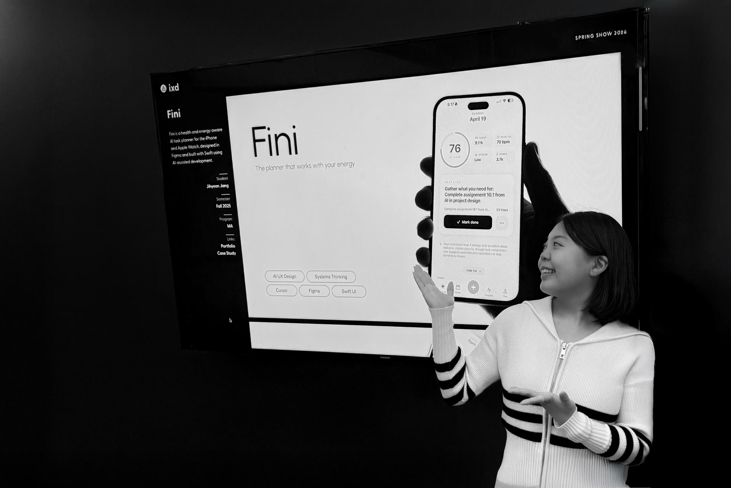
Recognition
Selected for the Academy of Art University 2026 Spring Show!
Research
Personal goals were pushed back until little energy remained
Look at the plans you finished this week, then look at the ones you postponed. Personal goals rarely did, even when they mattered more to your long-term growth. Why does this keep happening?
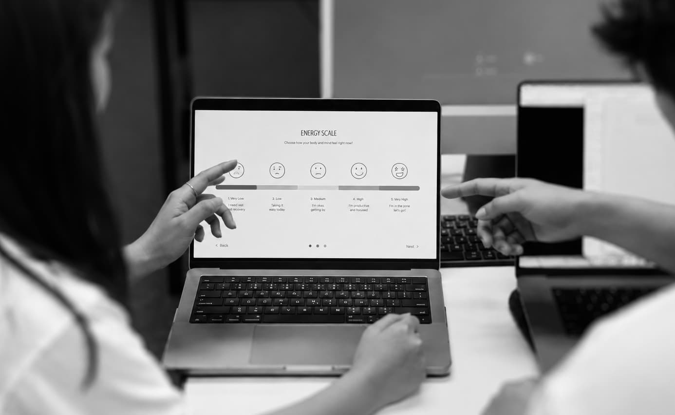
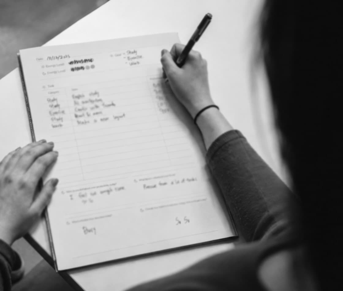
Behavioral pattern analysis
In a 6-day diary study, I found that users often returned to personal plans only after external obligations had already consumed their time and energy.
Affinity Mapping
I combined a 6-day diary study with semi-structured interviews to understand both what disrupted participants' plans and why. I mapped their diary entries and interview responses through affinity mapping, revealing two recurring patterns.
Insight 01
Follow-through rose and fell with daily capacity.
Participants completed less of what they planned on days with poorer sleep, higher stress, or lower energy.
Insight 02
Starting was the main point of failure.
Once participants began a task, they usually kept going. Most unfinished plans broke down before any action, at the moment of deciding where and how to begin.
Solution
Focus on the decision just before action
The research pointed to a critical moment before action: users returned to personal plans with changing capacity and still had to decide what was realistic and where to begin. I translated these findings into one design goal and two principles for Fini.
Research insights
Insight 01
Follow-through rose and fell with daily capacity
Insight 02
Starting was the main point of failure
Design goal
Help users begin with a manageable next step that fits their current capacity.
Design principles
Principle 01
Recommend a next step based on estimated capacity.
Principle 02
Make the starting point explicit.
From a goal to a next step the user can review
I designed the flow to turn a goal into smaller tasks and use an estimate of capacity to recommend where to begin. The flow includes the recommendation’s reasoning and options to edit or override it.
User input + context
User input
Spoken goal
“Finish my case study this week.”
Context input
Apple Health signals
Sleep · HRV · Activity
Fini system logic
Structure
Turn the goal into tasks and smaller steps.
Estimate
Estimate current capacity from Apple Health signals.
Recommend
Select or break down a next step.
User review
Recommended output
A recommended next step
Show the recommendation and the reasoning behind it.
Final Product
Fini: an AI planner that turns personal goals into smaller steps and recommends where to start.
Fini adapts task recommendations to the user's current capacity. It uses Apple Health data to prioritize tasks, breaks down larger tasks when capacity is low, and turns voice input into a structured plan.
Feature 01
Give users a smaller place to start
Research pointed to difficulty getting started. I designed Fini to break larger tasks into smaller steps when estimated capacity is low, giving users a specific starting point.
Feature 02
Use health data to inform task priorities
Because participants’ energy varied from day to day, I explored Apple Health data as an input to task recommendations. Fini uses sleep, heart rate variability (HRV), and activity signals to estimate capacity and suggest priorities.
Feature 03
Capture the goal before organizing it
Users describe what they want to do in their own words. Fini turns the spoken goal into tasks, subtasks, and a suggested priority.
Process
Build the experience to test it on real devices
I built a working iOS and watchOS prototype to test live AI responses, HealthKit data, and cross-device behavior. Using Cursor helped me get the core workflow running early so I could evaluate how these parts worked together.
01
Define
PRD + Systems Architecture
ChatGPT · Cursor Plan Mode
02
Build
Working iOS + watchOS prototype
Cursor · SwiftUI · Supabase · Anthropic API
03
Test
On-device QA findings
Xcode · HealthKit · iPhone · Apple Watch
04
Refine
Refined cross-device experience
Figma · Cursor · SwiftUI
- 01
Define how the system works together
I created the PRD and Systems Architecture first to map the data flow, device responsibilities, permissions, and fallback states before coding. Because Fini works across iOS, watchOS, HealthKit, AI, and a backend, designing each screen separately would not show where the experience could break.
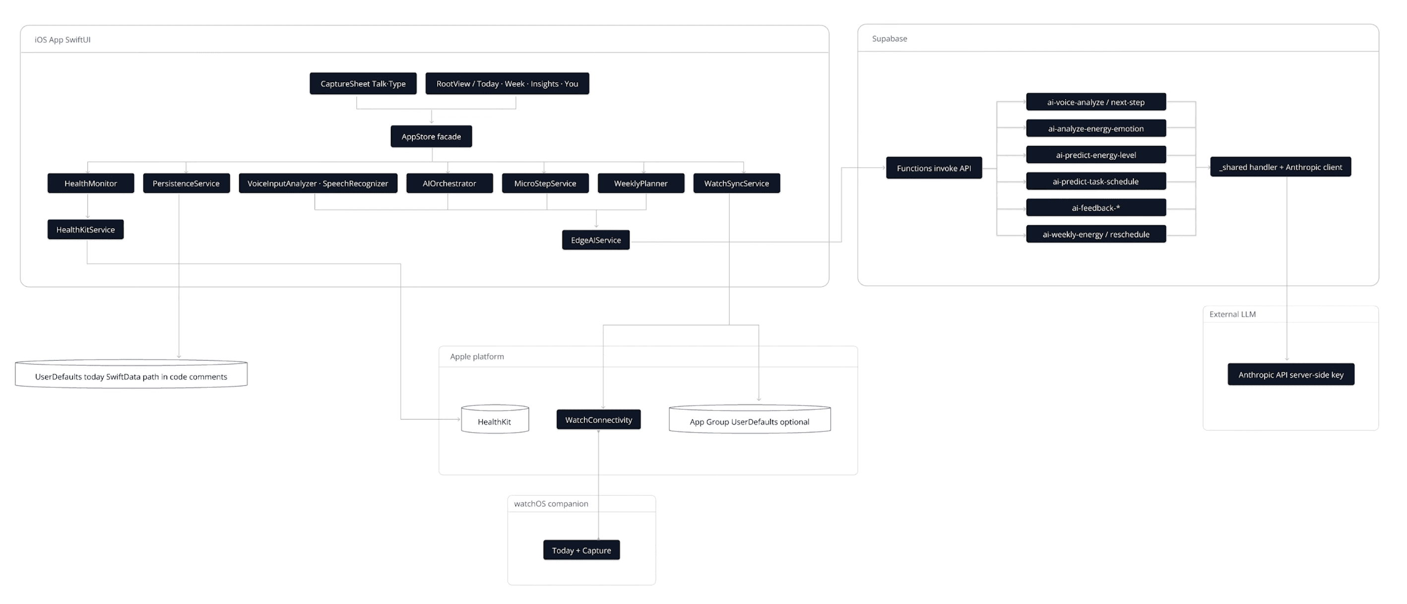
Systems Architecture across iOS, watchOS, HealthKit, Supabase, and Anthropic.
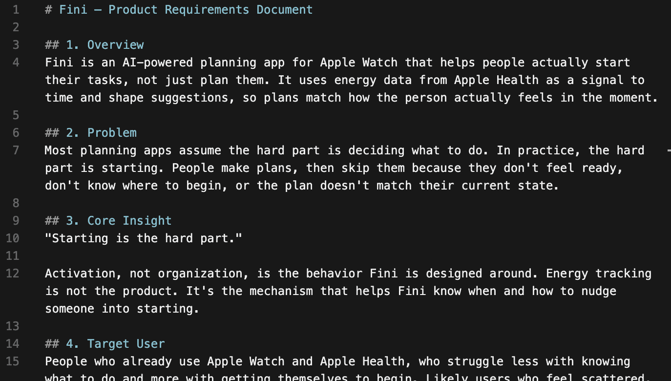
The PRD defined the problem, the core insight, and the target user before any screens existed.
- 02
Build and review the core workflow
I used the PRD and Systems Architecture as project context for the first working build. I reviewed the generated code and refined each feature against the product logic.
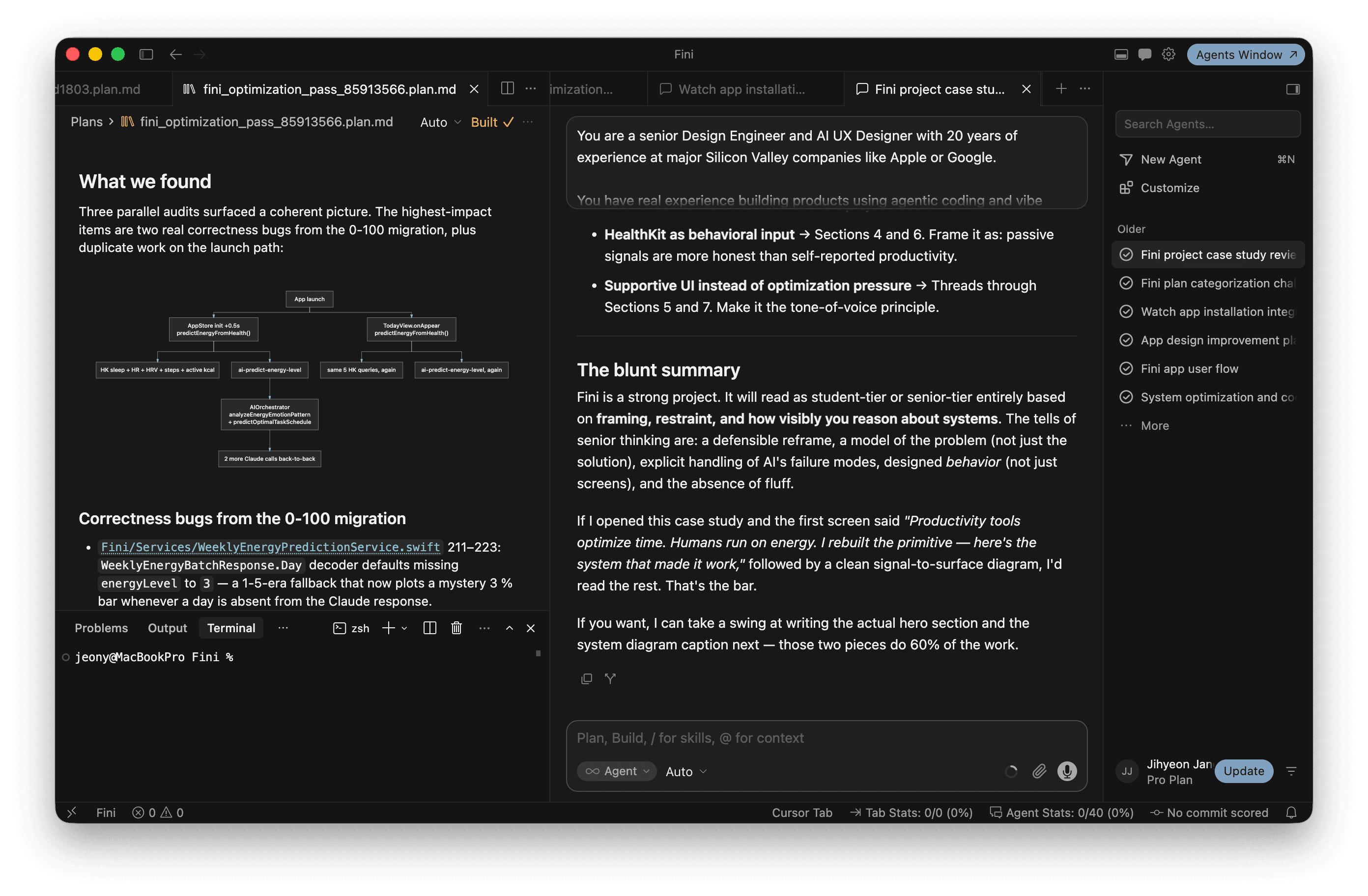
Each pass was reviewed against the product logic before it stayed in the build.
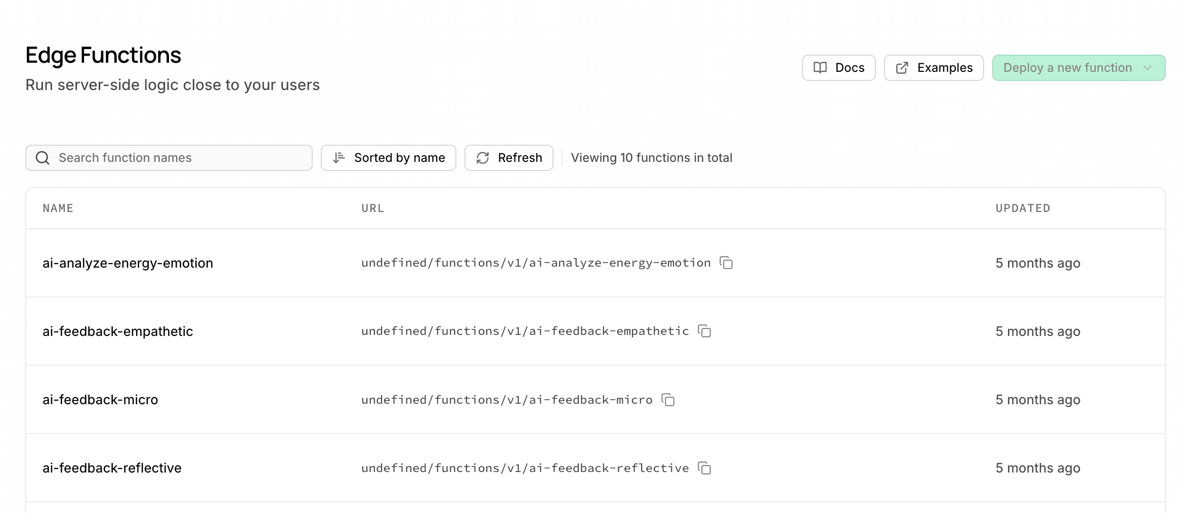
Anthropic’s API structured and prioritized tasks. I routed the API calls through a Supabase Edge Function, keeping the API key out of the client app. Supabase also stored the app data used for capacity estimation.
Supabase Edge Functions handled the AI calls for task structuring and prioritization.
- 03
Test in daily use
I used Fini in my daily routine and recorded issues in a QA log. I checked permissions, missing data, loading time, and iPhone–Watch behavior, then fixed the issues in short iterations.
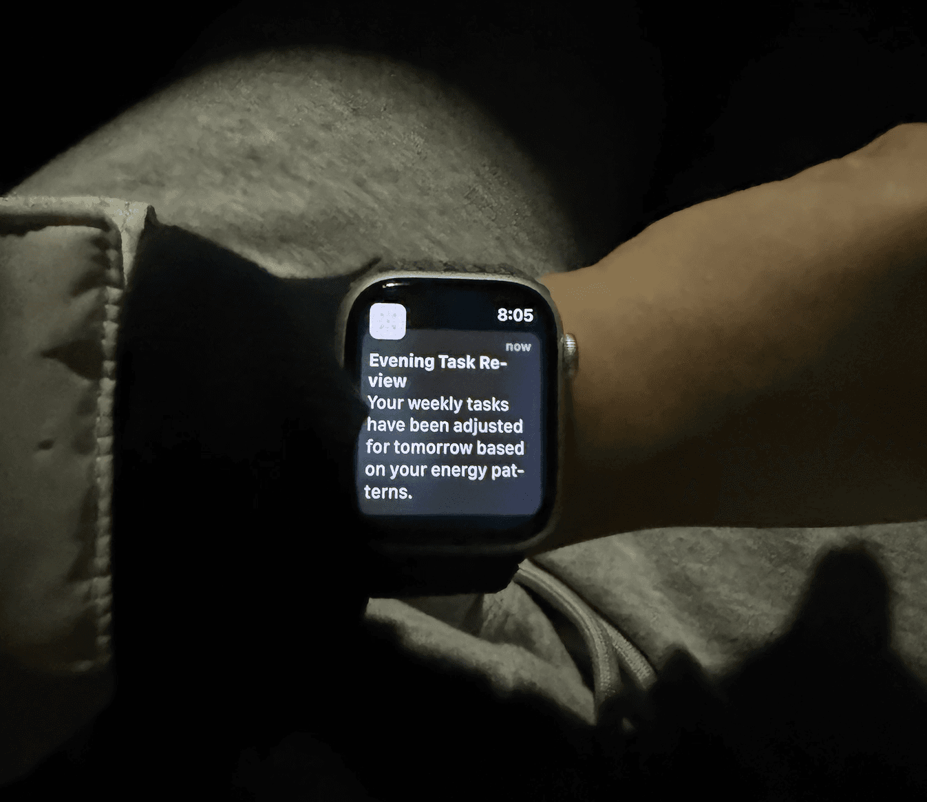
Testing in daily use surfaced timing, permission, and sync issues.
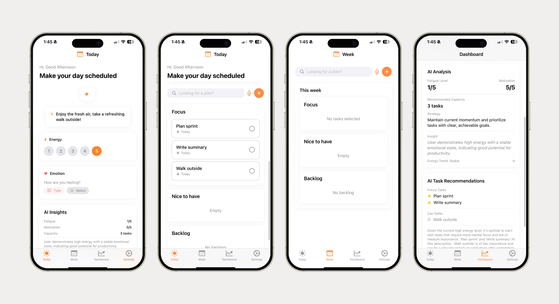
Working iOS screens used to verify live recommendations and cross-device states.
- 04
Refine hierarchy and interaction states
Once the core workflow was working, I refined the information hierarchy, interaction states, and visual consistency in Figma, then applied those changes to the iOS and watchOS build.
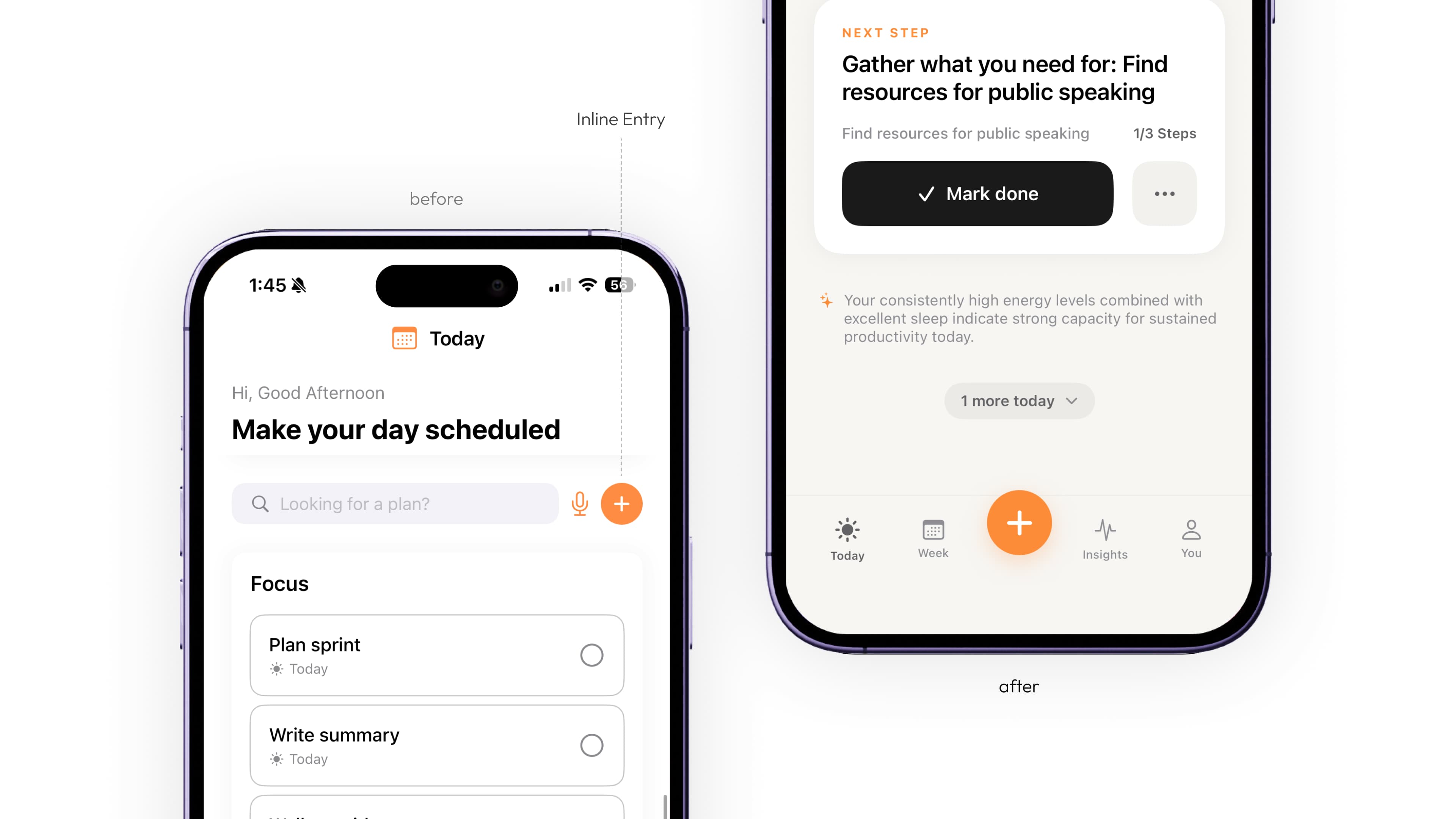
Task entry: from an inline control beside search to a prominent action in the bottom navigation.
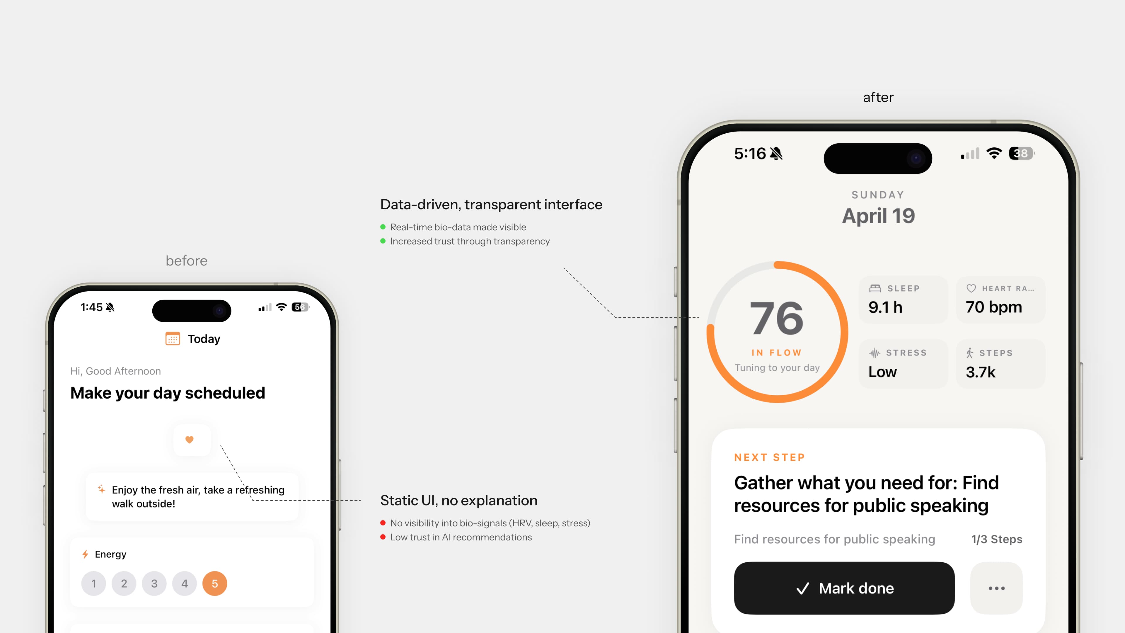
Recommendation context: health signals are shown alongside the next step.
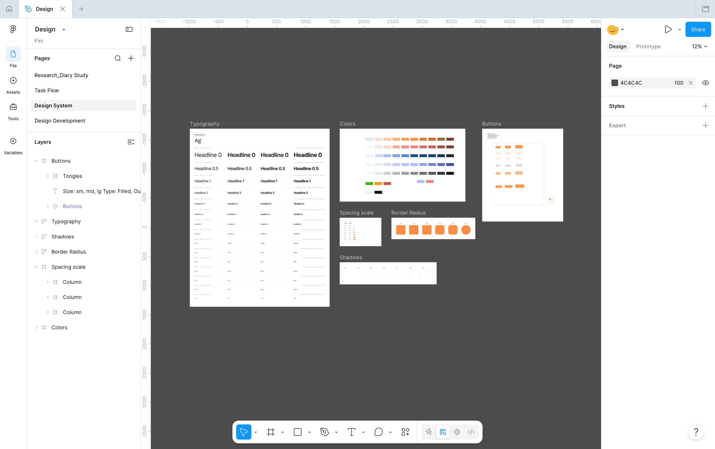
A shared design system kept type, color, and spacing consistent across iOS and watchOS.
Reflection
What I learned
Designing the connections between screens
Testing Fini in daily use surfaced issues with timing, permissions, and sync. Those issues showed me how much the experience depended on the connections between devices and data sources.